특징
이 페이지 특징은 마우스 오버 효과입니다.
마우스 오버 효과는
이미지, 텍스트, 버튼 등에 마우스 포인터가 올라갔을 때 발동되는 전환효과입니다.
각 카테고리 창 위에 마우스를 올리면 아래와 같이 회색으로 변합니다.
또, 더보기 버튼에 마우스를 올리면 + 버튼이 돌아가는 효과입니다.
자세한 사항은 상단 링크에서 확인해보시면 됩니다!
HTML - body
<body>
<section class="text__wrap section center nexon">
<div class="container">
<span class="section__small">NOTICE</span>
<h2 class="section__h2 mb70">스몰토크를 위한 얇고 넓은 지식</h2>
<div class="text__inner">
<div class="text t1">
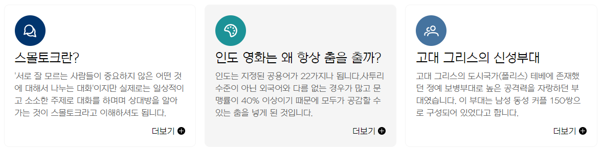
<h3 class="text__title">스몰토크란?</h3>
<p class="text__desc">'서로 잘 모르는 사람들이 중요하지 않은 어떤 것에 대해서 나누는 대화'이지만 실제로는 일상적이고 소소한 주제로 대화를 하며며 상대방을 알아가는 것이 스몰토크라고 이해하셔도 됩니다.</p>
<a class="text__btn" href="#">더보기</a>
</div>
<div class="text t2">
<h3 class="text__title">인도 영화는 왜 항상 춤을 출까?</h3>
<p class="text__desc">인도는 지정된 공용어가 22가지나 됩니다.사투리 수준이 아닌 외국어와 다름 없는 경우가 많고 문맹률이 40% 이상이기 때문에 모두가 공감할 수 있는 춤을 넣게 된 것입니다.</p>
<a class="text__btn" href="#">더보기</a>
</div>
<div class="text t3">
<h3 class="text__title">고대 그리스의 신성부대</h3>
<p class="text__desc">고대 그리스의 도시국가(폴리스) 테베에 존재했던 정예 보병부대로 높은 공격력을 자랑하던 부대였습니다. 이 부대는 남성 동성 커플 150쌍으로 구성되어 있었다고 합니다. </p>
<a class="text__btn" href="#">더보기</a>
</div>
<div class="text t4">
<h3 class="text__title">고양이와 심장병</h3>
<p class="text__desc">고양이를 키우면 심장질환 위험이감소된다는 연구구가 있습니다.미국 미네소타대학 뇌졸중연구소에서 진행된 실험으로 고양이를 키우는사람은 심장질환으로 사망할 위험이 30%나 적다고합니다.</p>
<a class="text__btn" href="#">더보기</a>
</div>
<div class="text t5">
<h3 class="text__title">아돌프 히틀러와 미술</h3>
<p class="text__desc">아돌프 히틀러의 꿈은 화가였습니다. 비엔나 예술대의 미술학교에 진학하길 원했으나 입학시험에서 탈락하였고 오스트리아 빈의 미술학교에 지원서를 제출했으나 낙방하였습니다.</p>
<a class="text__btn" href="#">더보기</a>
</div>
<div class="text t6">
<h3 class="text__title">1광년과 우리 은하</h3>
<p class="text__desc">빛은 1초당 약 300,000km 속도로 움직입니다. 따라서 1광년, 즉 빛이 1년동안 이동할 수 있는 거리는 대략 9조 4607억 3057만이고 우리 은하의 지름은 약 105,700광년입니다.</p>
<a class="text__btn" href="#">더보기</a>
</div>
</div>
</div>
</section>
</body>태그
<section> 태그는 문서의 섹션을 정의하며, class 속성으로 "text__wrap section center nexon" 값을 가지고 있습니다.
<div> 태그는 문서의 요소들을 감싸는 컨테이너 역할을 하며, class 속성으로 "container" 값을 가지고 있습니다.
<span> 태그는 짧은 문장이나 단어를 표시할 때 사용되며, class 속성으로 "section__small" 값을 가지고 있습니다.
<div> 태그들은 class 속성값으로 각각 "text t1", "text t2", "text t3", "text t4", "text t5", "text t6" 값을 가지고 있으며, 각각 하나의 텍스트 블록을 정의하고 있습니다
<h3> 태그는 문서의 소제목을 정의하며, 각각의 텍스트 블록에 포함된 내용을 설명하고 있습니다. <p> 태그는 문서의 텍스트를 정의하며, 각각의 텍스트 블록에 포함된 내용을 설명하고 있습니다.
<a> 태그는 하이퍼링크를 정의하며, class 속성으로 "text__btn" 값을 가지고 있습니다.
위 코드는 하나의 섹션(구간)에서 여러 개의 텍스트 블록(내용설명) 을 각각 정의하고 있습니다.
Style
<style>
          * {
               margin: 0;
               padding: 0;
          }
          a {
               text-decoration: none;
               color: #000;
          }
          h1,h2,h3,h4,h5,h6 {
               font-weight: normal;
          }
          img {
               vertical-align: top;
               width: 100%;
          }
          .mt10 {margin-top: 10px !important;}
          .mt20 {margin-top: 20px !important;}
          .mt30 {margin-top: 30px !important;}
          .mt40 {margin-top: 40px !important;}
          .mt50 {margin-top: 50px !important;}
          .mt60 {margin-top: 60px !important;}
          .mt70 {margin-top: 70px !important;}

          .mb10 {margin-bottom: 10px !important;}
          .mb20 {margin-bottom: 20px !important;}
          .mb30 {margin-bottom: 30px !important;}
          .mb40 {margin-bottom: 40px !important;}
          .mb50 {margin-bottom: 50px !important;}
          .mb60 {margin-bottom: 60px !important;}
          .mb70 {margin-bottom: 70px !important;}


          .container {
               width: 1160px;
               margin: 0 auto;
               padding: 0 20px;
               /* background-color: rgba(0, 0, 0, 0.1); */
          }
          .nexon {
               font-family: 'NexonLv1Gothic';
               font-weight: 400;
          }
          .section {
               padding: 120px 0;
          }
          .center {
               text-align: center;
          }
          .section__small {
               font-size: 14px;
               border-radius: 50px;
               padding: 1px 23px;
               background-color: #01356E;
               color: #fff;
               text-transform: uppercase;
               display: inline-block;
               margin-bottom: 20px;
          }
          .section__h2 {
               font-size: 50px;
               font-weight: 400;
               margin-bottom: 30px;
               line-height: 1;
          }
          .section__desc {
               font-size: 22px;
               line-height: 25px;
               color: #666666;
               margin-bottom: 70px;
               font-weight: 300;
               line-height: 1.5;
          }
          /* text__wrap */
          .text__inner {
               text-align: left;
               display: flex;
               flex-wrap: wrap;
               justify-content: space-between;
          }
          .text__inner .text {
               width: 32.3333%;
               border: 1px solid #f5f5f5;
               border-radius: 10px;
               padding: 90px 20px 20px 20px;
               box-sizing: border-box;
               margin-bottom: 20px;
               transition: all 0.3s;
               cursor: pointer;
               position: relative;
          }
          .text__inner .text:hover {
               background-color: #f5f5f5;
          }
          .text__title {
               font-size: 24px;
               margin-bottom: 10px;
          }
          .text__desc {
               font-size: 16px;
               color: #666;
               margin-bottom: 15px;
               line-height: 1.5;
          }
          .text__inner .text::before {
               content: '';
               width: 60px;
               height: 60px;
               background-color: #081669;
               background-image: url(../asset/img/textType01_01.svg);
               background-repeat: no-repeat;
               background-position: center;
               position: absolute;
               left: 20px;
               top: 20px;
               border-radius: 50%;
          }
          .text__inner .text.t1::before {
               background-color: #01356E;
               background-image: url(../asset/image/textType01_01.svg);
          }
          .text__inner .text.t2::before {
               background-color: #1C9297;
               background-image: url(../asset/image/textType01_02.svg);
          }
          .text__inner .text.t3::before {
               background-color: #45739F;
               background-image: url(../asset/image/textType01_03.svg);
          }
          .text__inner .text.t4::before {
               background-color: #CE7082;
               background-image: url(../asset/image/textType01_04.svg);
          }
          .text__inner .text.t5::before {
               background-color: #CCBBAA;
               background-image: url(../asset/image/textType01_05.svg);
          }
          .text__inner .text.t6::before {
               background-color: #4F3A4B;
               background-image: url(../asset/image/textType01_06.svg);
          }
          .text__btn {
               float: right;
               position: relative;
               padding-right: 20px;
          }
          .text__btn::before {
               content: '';
               position: absolute;
               right: 0;
               top: 0;
               width: 15px;
               height: 15px;
               background-image: url(../asset/image/icon_plus.svg);
               transition: all 0.3s;
          }
          .text__btn:hover::before {
               transform: rotate(360deg);
          }
     </style>
마우스 오버
CSS를 사용하여 버튼에 화살표 아이콘을 추가하고,
해당 아이콘이 마우스 오버시 360도 회전하는 효과를 만들어 보겠습니다.
첫 번째 블록인 .text__btn은 버튼에 대한 스타일을 정의합니다.
float: right는 버튼을 오른쪽으로 떠있게 만듭니다.
position: relative은 해당 엘리먼트의 위치를 상대적으로 조정할 수 있도록 합니다.
padding-right: 20px은 버튼 내부에 오른쪽 여백을 추가합니다.
두 번째 블록인 .text__btn::before는 가상 선택자를 사용하여 버튼 내부에 콘텐츠를 추가합니다.
content: ''는 콘텐츠를 빈 문자열로 설정합니다.
position: absolute는 해당 엘리먼트를 부모 엘리먼트를 기준으로 절대적인 위치로 배치하도록 합니다.
right: 0과 top: 0은 해당 엘리먼트를 부모 엘리먼트의 오른쪽 상단 모서리에 배치하도록 합니다.
width: 15px와 height: 15px는 아이콘의 크기를 지정합니다.
background-image: url(../asset/image/icon_plus.svg)는 배경 이미지를 설정합니다.
마지막 블록인 .text__btn:hover::before는 마우스 오버시 아이콘에 대한 스타일을 정의합니다.
transform: rotate(360deg)는 해당 엘리먼트를 360도 회전시키는 효과를 줍니다.
transition: all 0.3s는 모든 속성에 대해 0.3초의 전환 효과를 부여합니다.
따라서 마우스 오버시 아이콘이 부드럽게 회전하는 것을 볼 수 있습니다.